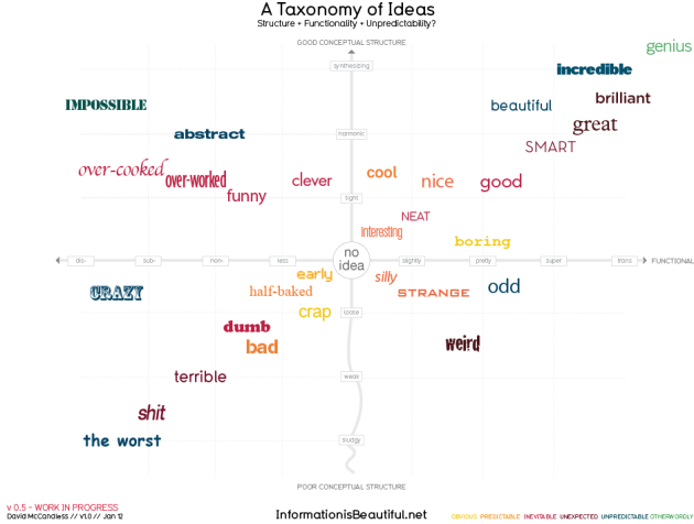
Information is Beautiful is taking this idea to extremes and presents its working model of a scale of ideas, measured against an x-axis of functionality, and a y-axis of conceptuality. Where does the idea for this chart score? Is it silly, funny, clever, or simply beautiful?
. .


